NEW! The Gist (APR-24) | E-BOOKS |
(Paper) CSAT: Data Interpretation & Reasoning
Data Interpretation & Reasoning
Now-a-days, Data Interpretation Tests have become an important part of all competitive examinations. Decision-making forms the core of all managerial & administrative activities. Since the complexity of business environment makes the process of decision-making difficult, the decision-maker cannot rely entirely upon his/ her observations, experience or evaluation to reach a decision. Decisions have to be based upon data, which exhibit relationship, indicate trends and show rates of change in terms of relevant variables.
Similarly, in our daily life we come across figures, statistics and statements of all sorts. These could be anything ranging from India’s exports of various commodities to different countries to the study plans of a student. In fact, rarely can we do without figures and facts. Figures, statistics, statements, etc. relating to any event are termed as Data. But data as such is of very little use unless it is organized. Officers take decisions on the basis of available information or data. Unless data is properly collected, analyzed and presented, it may not be useful for decision making. Raw data may not be easily comprehensible, and it becomes essential to classify and present it in a meaningful manner. This act or organizing and interpreting data to get meaningful information is known as Data Interpretation.
Data interpretation requires four basic skills:
- A student’s ability to structure a given problem,
- his/her persistence and willingness to try different approaches to crack a problem,
- an ability to reason logically and last but not the least
- an ability to focus on a given piece of information for a specific period of time.
Data Interpretation & Reasoning (DI & R)
Reasoning section can further be divided into four parts:
- PURE DI (DI)
- DATA SUFFICIENCY (DS)
- ANALYTICAL REASONING (AR)
- LOGICAL REASONING (LR)
PURE DI
This part deals with the problems, which require knowledge of calculation, approximations, combined with a good observation. These types of questions can be classified under following sub headings.
- Line graphs
- Data Tables or Numerical Tables
- Bar Graphs
- Pie Charts
- Combination Graphs
LINE GRAPH
- Line Graph gives the approximate idea of the data.
- It gives a clear picture of trends and comparisons than mere numbers.
- Slope is the most important observation in the case of Line graph. It facilitates in comparing the magnitude of change between any two consecutive points on graph. Steeper the slope, greater is the change in magnitude between two consecutive points.
Illustration I
Directions Qs. 1 to 3: Answer the questions on the basis of the data
presented in the figurebelow.

1. During 1996-2002, the number of commodities that exhibited a net overall
increase and net overall decrease, respectively, were:
(a) 3 and 3
(b) 2 and 4
(c) 4 and 2
(d) 5 and 1
2. The number of commodities that experienced a price decline for two or
more consecutive years is:
(a) 2
(b) 3
(c) 4
(d) 5
3. For which commodities did a price increase immediately follow a price
decline only once in this period?
(a) Rice, Edible oil, and Dal
(b) Egg and Dal
(c) Onion only
(d) Egg and Onion
DATA TABLE
Data tables or Numerical Tables are the simplest and most convenient tool for presenting data. Using an array of rows and columns, this is the easiest and most accurate way to define data in nongraphical manner. However, it is cumbersome and time consuming to scan the data in tables & the interpretation becomes difficult when one needs to find the trends and comparisons.
Illustration II
Directions Qs. 4 to 6: Study the following tables carefully and answer the
questions given below it.
Details of the top 20 schools in the US as ranked by US News and World Report, 1997 are given below.
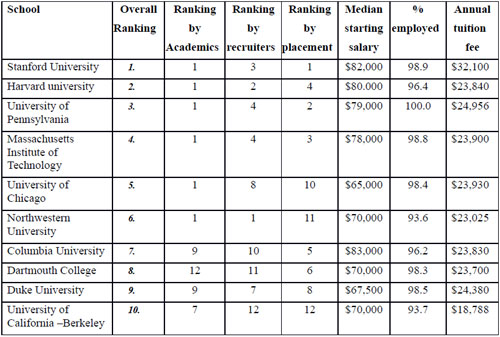

4. Madhu has received admission in all schools listed above. She wishes to
select the highest overall ranked school whose (a) annual tuition fee does not
exceed $23,000 and (b) median starting salary is at least $70,000. Which school
will she select?
(a) University of Virginia
(b) University of Pennsylvania
(c) Northwestern University
(d) University of California–Berkeley
5. In terms of starting salary and tuition fee, how many schools are
uniformly better (higher median starting salary AND lower tuition fee) than
Dartmouth College?
(a) 1
(b) 2
(c) 3
(d) 4
6. How many schools in the list above have single digit rankings on at
least 3 of the 4 parameters (overall ranking, ranking by academics, ranking by
recruiters and ranking by placement)?
(a) 3
(b) 9
(c) 4
(d) 8
BAR GRAPH
Bar graphs are one of the many techniques used to present data in a visual form so that the reader may readily recognize patterns or trends. Bar graphs are an excellent way to show results that are one time, that isn’t continuous - especially samplings such as surveys, inventories, etc. In the case of Bar Graph, the data is on the horizontal and vertical axis. A bar graph may be either horizontal or vertical. The important point to note about bar graphs is their bar length or height—the greater their length or height, the greater their value. Bar graphs usually present categorical and numeric variables grouped in class intervals. They consist of an axis and a series or labelled horizontal or vertical bars. The numbers on the x-axis of a bar graph or the y-axis of a bar graph are called the scale.

Whats Hot!
Downloads
- New! THE HINDU, YOJANA, PIB PDF
- New! UPSC PRELIM Papers 2004-2023
- IAS परीक्षा पेपर in Hindi 2004-2023
- UPSC Syllabus PDF Download
- New! IAS MAINS Papers 2010-2023
- PDF Study Notes for UPSC (Hot!)
- E-books PDF Download
- NCERT Books Download | NCERT Hindi PDF
- New! UPSC MAINS SOLVED PAPERS PDF
- OLD NCERT PDF
- UPSC 2024 Exam Calendar