(IGP) IAS Pre: GS - Paper -2 - Data Interpretation And Data Sufficiency - Pie Chart
Pie Charts
Circle graphs are used to show how various sectors share in the whole. Circle graphs are sometimes called pie charts. Circle graphs usually give the percentage that each sector receives.
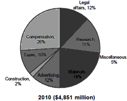
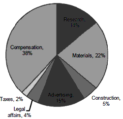
Expenditure of Major Industries 2000 ($3,087 million)


Q. The amount spent on materials in 2000 was 120% of the amount spent on
(a) research in 2000
(b) compensation in 2000
(c) advertising in 2010
(d) materials in 2010
In 2000, 18% of the expenditures were for materials. We want x where 120% of x = 18%; so x = 15%. Any category that received 15% of 2000 expenditures gives the correct answer, but only one of the five choices is correct. Here, the answer is (a) since research received 15% of the expenditure in 2000.
Example
Directions : Study the following information to answer the given questions.
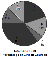
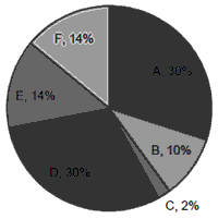
Percentage of students in various courses (A, B, C, D, E, F) and
Percentage of girals out of these.
Total Student: 1200 (800 girls + 400 boys) Percentage in Various Courses


1. For which course is the number of boys the minimum?
(a) E
(b) F
(c) C
(d) A
2. How many girls are there in course C?
(a) 44
(b) 16
(c) 40
(d) 160
3. For course D what is the respective ratio of boys and girls?
(a) 3 : 4
(b) 4 : 5
(c) 3 : 5
(d) 5 : 6
4. For which pair of courses is the number of boys the same?
(a) E and F
(b) A and D
(c) C and F
(d) B and D
5. For course E, the number of girls is how much percent more than the
boys for course E?
(a) 250
(b) 350
(c) 150
(d) 80
Solution:
Calculations for questions (1–5)
| Courses | Boys | Girls | Total |
| A | 0 | 240 | 240 |
| B | 100 | 80 | 180 |
| C | 44 | 16 | 60 |
| D | 180 | 240 | 420 |
| E | 32 | 112 | 144 |
| F | 44 | 112 | 156 |
1. (d)
2. (b)
3. (a)
4. (c)
5. (a)
© UPSCPORTAL.COM

