(Getting Started) ANSWER WRITING - How To Incorporate Charts And Graphs To Your Answers

(Getting Started) ANSWER WRITING - How To Incorporate Charts And Graphs To Your Answers
As so many toppers have already vouched, answer writing in UPSC Mains is what gets an aspirant their rank. However, it is not always easy to score. Knowledge is not the only relevant skill you need to write good answers. An examiner reads hundreds of answer sheets and your answer must stand out so that they find it interesting enough to mark your answer above average. This is why aspirants use headings, sub-headings, bullet points, etc. And this is also why charts and graphs hold an important place in UPSC aspirants’ minds.
Different Types Of Charts And Graphs
Information, whether statistical or empirical, can be represented via charts and graphs. The most popular ones that help you not only enhance your answer quality but also keep your answers short and crips while showcasing all relevant information are given below –
-
Flow Chart
Flow charts are undoubtedly the most popular form of explainers used by UPSC aspirants in their answers. One of the reasons they are so popular is because they allow us to represent a flow of events or a timeline or just conditional facts in a very compact and clear way, often saving aspirants the trouble of writing 100s of words and cluttering their paper.
Below are a few representations of flow charts used to explain or analyze different topics –

Effects of Globalization on Indigenous Economy
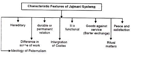
Failure of the Jajmani System
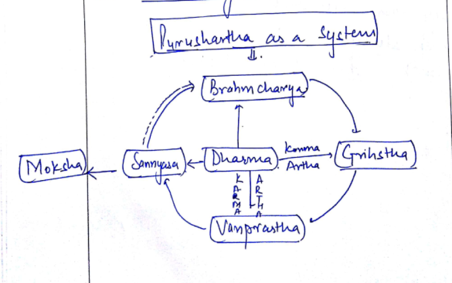
Explaining the System of Purushartha
-
Pie Chart
Pie charts are mostly used to explain percentages. By virtue of this nature, they are an excellent tool to represent data uncovered by committee reports, the census, or the budget, and such similar documents. Pie charts explain shares each component hold and the total circle represents the whole system together. Below are a few examples of pie charts used to answer questions of different topics –
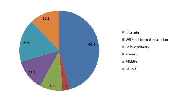
Education Level Amongst Female Indian Citizens Between The Age Of 15-49
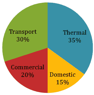
CO2 Emissions by Various Sectors
-
Bar Graph
Bar graphs are used for comparison among different groups. These are also great tools to showcase diversity as well as inequality and can often be used to present data found on different government reports such as wealth distribution among different castes, land distribution among states, etc. Below are a few examples –
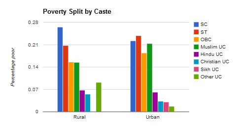
Wealth Distribution Among Castes Between Rural And Urban Areas
Literacy Among Rural and Urban Population by Gender
-
Line Graph
Line graphs show data across a timeline and are used as a comparison metric for progress, or the lack thereof. Often, these graphs find their place in analytical answers that spans decades and is a well-developed tool for representing any time-specific data. Below are a few examples –
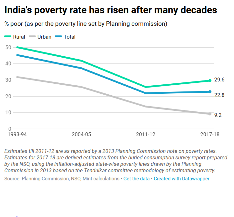
A Timeline of India’s Rise from poverty

GDP Growth
Use Them Right To Score High
Whenever relevant, try and use these pictorial representations of data to make for more interesting answers. However, do not overdo it as that may have a negative impact. Remember which chart or graph best represents which type of data and never forget to label them properly. With mains right around the corner, we hope this trick will not only help you right better answers but also help you complete your paper on time. Keep practicing answer writing and surely you will overcome the hurdle that is UPSC Mains Examination.
Best of Luck!
© IASEXAMPORTAL
CLICK HERE TO DOWNLOAD UPSC TOPPERS NOTES